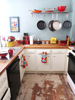
Kitchen floors, halfway there.
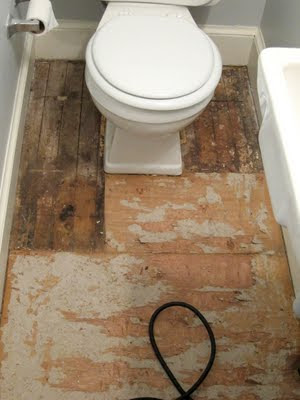
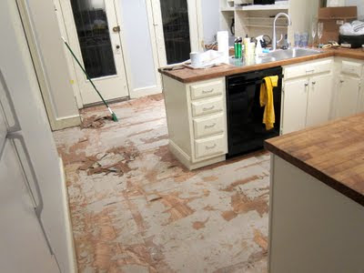
The south end of the kitchen (including the bathroom and pantry) was a beast on Night 1... nearly every piece had to be jigsawed due to the separate rooms and the lack of a true right angle or straight line anywhere in this 100-year old house. Huge props to T for working solo on Night 2 while I had a community meeting. He rocks.
We are so close! My sis just moved up their trip from Saturday to Friday, which means we only have one more night to kid-proof this room. Night 3 it is.
We'll do the edging along the walls next week. Whew!
Thursday, June 30, 2011
Tuesday, June 28, 2011
Adulthood
Oh, weddings. The bride and room were ecstatic, the crowd was there to party, the conversation was charged, and the booze was flowing (no really: my favorite scene of the evening was the friar in full robes holding a case of beer at 2 a.m.)... What more does one need, right?
One tiny little other thing, in my case: drama-free interactions with my ex-boyfriend. I know, I neglected to mention that this wedding was kind of a big deal personally. But it was. And it was fine. Thank goodness. My head knew it would be okay, and our last interaction was normal, but it's still tough not to be nervous in that situation. By night's end, there were the four of us laughing over drinks in the back corner of the after-party: me, T, him, and his wife. Two couples. The right configuration of partners. Everyone happy in their decisions, comfortable in their own skin. And that deserves a toast in its own right, doesn't it? (Oh I toasted it, all right. Repeatedly.)
And so Sunday, in between crashing head pains on the way home, the breaths I took were deep ones, full of relief. And they felt good.
So since I'm sounding pretty adult right now, why don't I give you a peek at what our dining room floor looks like?
Those are our kitchen floor planks, stacked up and ready to go. Installation begins tonight.
Hold me.
Friday, June 24, 2011
There's got to be a better title than "Random"
So, ummm... this week flew by. Oops.
Work is busy. Life is busy. We are kicking tail around the house every night, but not in the barely-functioning stressful way we were before. Instead we're staying calm and making incremental progress. It's good. Next week I'll try to take photos. It's really feeling like a home around here, which for me is all about having things on the wall to smile down at me.
We're off to New York for a wedding tomorrow. I get to pit-stop in the city, then spend Friday night at my pal Amy's glass house in the woods of Westchester, then we head up to Poughkeepsie for the wedding Saturday. I've never been to Poughkeepsie. I would ask for tips on what to see and do, but we won't even be there 24 hours, so I'll focus instead on how to magically create a fantastic updo myself, in a hotel room, with minimal supplies, that will hold throughout the wedding and photograph wonderfully.
Here's are some odds and ends for ya. Not much, but it's all I've got:
File this under: Incredibly Annoying. I've been battling my achilles tendon for five weeks now. I tried nursing it for a while, but it became so painful that I had to stop working out for two weeks. I eased back in slowly, but it's still not ready for high impact activity - even with this sexy brace that T bought me. I've been limiting myself to weight-based workouts and floor moves, but the thing is so tender it'll flare up on me walking home from the Metro or over to the park. Not fun at all... and not exactly helping the beach-season cause. Has anyone ever dealt with achilles tendonitis? The pain is something fierce... just entirely different from any other sort of injury I've ever had.
Oops. I didn't mean to buy all this product. But you know, it happens. Much like having a wedding enabled me to justify all sorts of random not-exactly-wedding-related purchases, attending a wedding suddenly renders shimmery Black Jade eyeliner a life-or-death necessity. There is no logic, only consumer lust. The shadows (Lilium) are from Chanel's summer collection and are truly gorgeous, but a certain someone I know picked up the showstopper from the collection during our spree: the gorgeous yellow nail polish Mimosa, apparently this summer's "it" color, and also apparently life-changing. Nole will have to report back to us on that one.
I'm wearing these patent nude pumps to the wedding, and it occurs to me that we should pause for a moment to celebrate the nude pump. I swear they make legs look a mile longer. Magic shoes, they are. I'll need a little magic to distract from the wreckage of Sunday's mosquito massacre, so let's hope these do the trick. I'm wearing them with the emerald green dress from T's birthday dinner last year. I was going to wear this fun dress, but then discovered that the wedding is more formal than I originally thought. And really, I'm dying to wear emerald again. Paired with green-hued eyeliner, of course.
But to the important thing: this couple who's tying the knot in front of us all. I'm so thrilled for them and the way they make each other happy. I've known the groom through some big highs and lows for us both, and seeing him snag this incredibly amazing woman is probably going to make me cry. But in a ridiculously happy way. Better pack my waterproof mascara.
Have a wonderful weekend, everyone!
Tuesday, June 21, 2011
Summer Eats
We don't have a dining room table yet. It's supposed to arrive next week, but even after it gets here it'll be a while before we have chairs. We also don't have a kitchen table yet, because I wanted to wait until our kitchen floor is in before buying one. Same goes with kitchen chairs. So where have we been eating?
A) On the couch/coffee table, typically in front of The West Wing (oh yes, Project Liberal Porn is still going... we're on Season 6)
B) Outside
As much as I made fun of our '70s-era blue boat of a backyard when we bought this house, I have to admit that we've been sort of loving it. The color is still heinous, but the structure does have its benefits. One of those is plentiful seating, even outside of our patio furniture. Eating out there is a natural choice these days, with the only downside being that my legs currently have 23 mosquito bites on them (I'm going to look so hot at a wedding on Saturday... so hot).
The other night we put together a dinner that was so fresh and summery and delicious - despite the fact that the fish was cooked inside - that I thought I'd share it here. It's been awhile since I posted a recipe, after all. To make up for it... here's three!
Grilled Cajun Corn and Pan-Seared Mahi Mahi with Cilantro Chimichurri
Grilled Cajun Corn
Adapted from Weber's Big Book of Grilling
- 4 ears fresh sweet corn in their husks
- 4 tablespoons unsalted butter, softened
- Your favorite Cajun spice blend, homemade or packaged (I like keeping a fresh mix of Emeril's "Essence" around)
Soak the ears of corn in cold water for at least 30 minutes. If necessary, use a weight to keep the ears submerged. Drain.
Meanwhile, make the butter: In a small bowl mix together the spice blend and the butter with a fork.
Pull back the husks of each ear of corn, leaving them attached at the stem. Remove and discard the corn silk.
Spread about 1 tablespoon of the seasoned butter evenly over the kernels of each ear. Fold the husks back over the kernels and use string or a thin strip of husk to tie them at the top.
Grill the corn over direct medium heat until the kernels are tender, 25 to 30 minutes, turning three or four times during grilling time. For an extra smoky flavor, allow the ears to brown. Eat off the husks or cut the corn off with a knife.
Pan-Seared Mahi Mahi
Adapted from Wegman's
Adapted from Wegman's
- 4 fresh wild-caught mahi mahi fillets
- salt, pepper, and flour
- 1 tablespoon olive oil
- 1 tablespoon butter
Heat olive oil in pan on medium-high until oil faintly smokes; add fish. Turn over when fish changes color one-quarter of way up and seared side has turned paper-bag brown, 3 min.
Reduce heat to medium. Cook about 4 min, until internal temp reaches 120 degrees. Check by inserting thermometer halfway into thickest part of fish.
Add basting oil and butter to pan; swirl. Baste with spoon, 1-3 min, until internal temp reaches 130 degrees.
Transfer fish to clean platter; let rest at least 2 min. Top with Cilantro Chimichurri, or other yummy sauce, or none at all!
Cilantro Chimichurri
I double-triple-quadruple love this stuff. A week ago we ate it over grilled veggies and meat in fajitas. The other night, fish. Don't like cilantro? Use your favorite herb instead. Parsley chimichurri makes a mean burger topping. Mint chimichurri would be out of control on top of fresh-grilled lamb. The recipe is from Mark Bittman.
Taste and adjust the seasoning , the serve or cover and refrigerate for up to a couple of days.
Add basting oil and butter to pan; swirl. Baste with spoon, 1-3 min, until internal temp reaches 130 degrees.
Transfer fish to clean platter; let rest at least 2 min. Top with Cilantro Chimichurri, or other yummy sauce, or none at all!
Cilantro Chimichurri
I double-triple-quadruple love this stuff. A week ago we ate it over grilled veggies and meat in fajitas. The other night, fish. Don't like cilantro? Use your favorite herb instead. Parsley chimichurri makes a mean burger topping. Mint chimichurri would be out of control on top of fresh-grilled lamb. The recipe is from Mark Bittman.
- 2 cups loosely-packed fresh cilantro leaves (or other herb)
- salt
- 1 clove garlic, peeled
- 2 tablespoons peanut oil or neutral oil, like grapeseed or corn
- 1 tablespoon freshly squeezed lime juice
Taste and adjust the seasoning , the serve or cover and refrigerate for up to a couple of days.
Friday, June 17, 2011
Industrial Chic
A wee bit exhausted over here. I've been getting paid to play in Pennsylvania's Lehigh Valley all week, where I got to nerd out to industrial architecture and frolic amidst the sort of community character that other communities spend millions trying to create. Community character is like style or sexiness or grace ... you just have it or you don't. I prefer hanging out in communities that have it. My apologies to suburban development codes that try in vain to create a sense of place by reducing setbacks and adding facade treatments onto their strip malls.
(Ummm... am I writing about planning on my frivolous blog? Too tired to stop now... I'm going with it.)
One of my pet professional interests is adaptive reuse, which at its essence means reusing an existing structure for a new purpose. The benefits of doing so are that we don't tear down and build anew, usually with new codes that make the sort of yummy development we used to have illegal; that we can honor the character and legacy of older structures, which is really a way to honor ourselves and our communities; and that by introducing new activities in older places, we have an opportunity to achieve a greater good and produce a new sort of energy, whether that be via affordable housing or entertainment activities.
I get pretty worked up about this sort of thing. Ask T what it's like to take the train from DC to CT with me, and he'll probably tell you how nerdy I get about the old factories that back up to the river and the tracks, how my mind reels with the possibilities. (More weird Maggie trivia: I never drink soda, but every time I ride Amtrak I have an insatiable urge for Pepsi.) This is more than a Northeast bias, by the way. A family joke regularly references my future bestseller: The Historic Downtowns of Eastern North Carolina. And you can imagine how excited I was living in New Mexico, surrounded by structures that pre-date anything on the East Coast by nearly a thousand years.
Anyway, this is a long aside to say that I don't have fun web finds for you today, mostly because I haven't had time to play online and find them. Instead, I bring you pretty pictures of the sort of thing I was appreciating all week. An educational Friday I'm in Love, perhaps. I hope some of you will find this interesting.
***
(Ummm... am I writing about planning on my frivolous blog? Too tired to stop now... I'm going with it.)
One of my pet professional interests is adaptive reuse, which at its essence means reusing an existing structure for a new purpose. The benefits of doing so are that we don't tear down and build anew, usually with new codes that make the sort of yummy development we used to have illegal; that we can honor the character and legacy of older structures, which is really a way to honor ourselves and our communities; and that by introducing new activities in older places, we have an opportunity to achieve a greater good and produce a new sort of energy, whether that be via affordable housing or entertainment activities.
I get pretty worked up about this sort of thing. Ask T what it's like to take the train from DC to CT with me, and he'll probably tell you how nerdy I get about the old factories that back up to the river and the tracks, how my mind reels with the possibilities. (More weird Maggie trivia: I never drink soda, but every time I ride Amtrak I have an insatiable urge for Pepsi.) This is more than a Northeast bias, by the way. A family joke regularly references my future bestseller: The Historic Downtowns of Eastern North Carolina. And you can imagine how excited I was living in New Mexico, surrounded by structures that pre-date anything on the East Coast by nearly a thousand years.
Anyway, this is a long aside to say that I don't have fun web finds for you today, mostly because I haven't had time to play online and find them. Instead, I bring you pretty pictures of the sort of thing I was appreciating all week. An educational Friday I'm in Love, perhaps. I hope some of you will find this interesting.
Bethlehem Steel
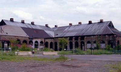
The former Bethlehem Steel plant is a massive 1600-acre complex in Bethlehem, PA. Take a minute and imagine how enormous that is. What's interesting about the site to me is that it's in progress. It's too big to be master-planned or taken on by a single buyer, so a variety of activities are happening there, some private, and some public.
A new Sands Casino featuring three (?!) Emeril restaurants is on site with an attached hotel, its entrance sign a reuse of one of Bethlehem Steel's original cranes. I'll admit, I'm not a casino person. I wish the insides of all those places didn't look largely the same due to the whirling lights and incessant beeps of slot machines. However, through the madness you can still appreciate the intent of the design, with angles, ducts, and beams that pay homage to the original plant. (The exterior facade of the hotel is another story... not a fan of that.) The heart of the campus' revitalization is ArtsQuest, a large arts and cultural center at the Stacks. In addition to the new building, a new outdoor pavilion for concerts and events is being constructed in front of the stacks, which are lit up at night.
There's no way to overestimate the enormity of these original structures. The building called the No. 2 Shop was the largest industrial building in the world when it was constructed in 1890. The facades and windows all exhibit the sort of purpose that new structures so often fall short in achieving. To me these sorts of purpose-driven details are beautiful.
Another facet of this project that I adore is that industrial work is still being done on the site, which grounds the entire campus in a way that isn't possible when we're only remembering and not doing (in other words: Disneyfication alert). Steel work for the Navy is still in production at one end of the campus; you can see examples of what they produce sitting outside the building, in perfect harmony with the steel-based art that dots the entire city.
I didn't have time to do a full tour of these structures on foot this week. My next trip out (and it appears I have a couple coming up) will absolutely involve an official tour. As well as packing my camera.
Easton Silk Mill
The old silk mill in Easton is probably a better example of manageable reuse projects for other cities, simply because it's more relatable in size. Most old cities still have buildings like this one, in various states of use or disrepair, of course. While this was originally a mill, buildings similar to this one are everywhere and not necessarily industrial in purpose.
The plan for the Silk Mill includes apartments, retail, a theater, and more... just like nearly every new mixed-use development that's underway nationwide. The value of using an old building like this with meaning to the city is what appeals here... and what has me perennially dreaming about the possibilities of new life in old places.
***
That's it's for my placemaking field trip show and tell. I'm hoping to wrap up work early today and get some much-needed rest in this 1906 house of ours... which is suddenly feeling not very old at all. Have a happy weekend, everyone.
Wednesday, June 15, 2011
Indigo moments
You know those moments when you catch yourself having a moment? I love when that happens.
Sometimes it happens to me at concerts, on one of those nights when the band is so good and the venue is so small/cool/unique/whathaveyou, that you know it's a show you'll always talk about.
Sometimes it happens to me at the beach, when I'm staring out at the sea and breathing in the salt and thinking, whether it be August or January, this is the place I'm supposed to be.
Sometimes it happens to me with T, or with my family, or with my girlfriends, and their particular combination of humor and character in the exact moment that they do something I love makes me realize all over again how lucky I am.
And sometimes I catch myself in a moment where I realize, this is me at my girliest. I realized yesterday, driving up to Pennsylvania to work for a couple of days, that I was in the middle of a pure Maggie girl moment. It's never shopping, never getting nails done, never anything like that. Here's the essence of estrogen for me: driving fast in a car, blasting the Indigo Girls, and squawking to my heart's content, with no one to hear me. Damn I love those ladies. They always make me wish I could sing. They've been there for falling in love and falling out of love, for new friends and old ones, and for any kind of mood I can muster.
My apologies to the Pennsylvania Turnpike toll collector and all passing vehicles... but wow did I need that moment yesterday.
Tuesday, June 14, 2011
Kitchen floor vision-shifting
So now that you're all caught up on what went down with our kitchen floors, let's get to the fun part... how we'll change them. But first, we should talk about how we originally wanted to change them.
The original floors that we uncovered in the bathroom seemed to be in decent shape. Definitely in need of some major cleaning and TLC, but solid. Because the kitchen runs right into the dining room and the length of the house can be seen in one view, we knew that for the floors to shine, they'd need to be brought up to the condition of those in the rest of the house. That felt like a big challenge... notice I didn't say the floors were in great shape. At this point we were also under the impression that we'd be able to finish this project before we moved in (ha!), so we didn't have weeks to spend cleaning, sanding, and refinishing the kitchen.
That's when I remembered one of my original loves: painted kitchen floors. I love the rustic look that painted floors can immediately provide a room, and also love the interplay between a rustic floor and more modern touches everywhere else. But as much as I love the look, the idea of pure paint didn't feel quite for this room... until I stumbled upon whitewash.
It occurred to me that if we cleaned the floors and then whitewashed them, we'd be camouflaging their condition a bit but unlike solid paint, still be able appreciate the grain of the wood. I love the softer, gauzy look of whitewash, which immediately makes me want to put on beach music and stir up a gin and tonic.
At this point in the game I was still wrapping my head around how to paint the kitchen walls. I hadn't yet discovered Benjamin Moore's Azores, but I already knew that my standard kitchen palette of bright red and yellow wasn't going to fly in this room. The kitchen seemed to want lighter tones, using my bright cookware and dinnerware as accent colors. It occured to me that adding a layer of color onto the floor, on top of the whitewash, might give me that pop of color I love while respecting the softer look that the kitchen seemed to want. I decided to do a diamond pattern in red, much like the second image below:
I was beyond excited about that plan. But then, the whole there-are-no-floors-here thing happened. And so for the past couple of months, we decided that our options were:
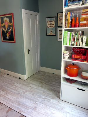
I'm excited about the rustic vibe this floor will give the kitchen, which will work with the old white cabinets we have now and the new white cabinets we hope to have one day. Between the Azores on the wall and the bright accents everywhere, our kitchen has been developing a bit of an island vibe, and I think this flooring will suit that perfectly.
We're hoping the installation will go smoothly. We're doing it ourselves to save money, and are a little worried about the general unevenness of this old house and all the cuts we have to do between the island/built-ins/pantry/bathroom. Folks who've Pergo'd their own houses have told us we'll be fine, so our fingers are crossed. The flooring should get here in two weeks, just days before my sister's fam visits, so the pressure will be on to get moving once it arrives.
Any whitewash fans out there? Any laminate success or horror stories? Send us your tips!
The original floors that we uncovered in the bathroom seemed to be in decent shape. Definitely in need of some major cleaning and TLC, but solid. Because the kitchen runs right into the dining room and the length of the house can be seen in one view, we knew that for the floors to shine, they'd need to be brought up to the condition of those in the rest of the house. That felt like a big challenge... notice I didn't say the floors were in great shape. At this point we were also under the impression that we'd be able to finish this project before we moved in (ha!), so we didn't have weeks to spend cleaning, sanding, and refinishing the kitchen.
That's when I remembered one of my original loves: painted kitchen floors. I love the rustic look that painted floors can immediately provide a room, and also love the interplay between a rustic floor and more modern touches everywhere else. But as much as I love the look, the idea of pure paint didn't feel quite for this room... until I stumbled upon whitewash.
It occurred to me that if we cleaned the floors and then whitewashed them, we'd be camouflaging their condition a bit but unlike solid paint, still be able appreciate the grain of the wood. I love the softer, gauzy look of whitewash, which immediately makes me want to put on beach music and stir up a gin and tonic.
I've lost all the sources for these images, sadly... but if they're yours, I'll be happy to credit you!
I was beyond excited about that plan. But then, the whole there-are-no-floors-here thing happened. And so for the past couple of months, we decided that our options were:
- Buy untreated wood planks, try to match the flow of the rest of the house, and do our whitewash/paint design anyway.
- Put in another flooring material altogether (I do love saltillo)
- Put in laminate flooring that looks like wood, and perhaps like whitewashed wood
- Real wood feels like a permanent solution - either with the original vision or something that matches the rest of the house as much as possible - but it seems like a lot of work for us to take on right now, and a bigger job than we have in mind.
- The non-wood/"wood" flooring options I love are costly, and I don't want to put in anything that I don't love.
- Easy to install, easy to maintain, available in tons of looks... and not so expensive that it prevents us from doing something different in a few years if we want to upgrade.
I'm excited about the rustic vibe this floor will give the kitchen, which will work with the old white cabinets we have now and the new white cabinets we hope to have one day. Between the Azores on the wall and the bright accents everywhere, our kitchen has been developing a bit of an island vibe, and I think this flooring will suit that perfectly.
We're hoping the installation will go smoothly. We're doing it ourselves to save money, and are a little worried about the general unevenness of this old house and all the cuts we have to do between the island/built-ins/pantry/bathroom. Folks who've Pergo'd their own houses have told us we'll be fine, so our fingers are crossed. The flooring should get here in two weeks, just days before my sister's fam visits, so the pressure will be on to get moving once it arrives.
Any whitewash fans out there? Any laminate success or horror stories? Send us your tips!
Monday, June 13, 2011
Our kitchen floor: The untold story
You might have noticed a few offhand remarks about having, you know, no kitchen floor. You didn't miss a post explaining how that came to pass... the truth is that I never wrote about it. We needed time to lick our wounds... or something like that. From the beginning, then. It's time.
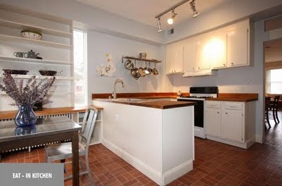
When we bought the house, faux-brick linoleum covered the kitchen, the downstairs bathroom, and the upstairs hallway. In an upstairs hall closet, a large piece of the linoleum had been taken off, showing the original hardwood floors underneath. We liked to imagine the same thing existed in the kitchen, which originally looked like this:
We spot-checked the floors in the areas where it was easiest to get under the linoleum without doing too much damage: underneath the refrigerator (a simple pull-out) and in the bathroom. In both areas, we saw the original floors that cover the rest of the house. Dirty, but there. We were thrilled.
Like my stair refinishing project, the kitchen floors seemed to be one of those tasks that would be about a thousand times more manageable if we could do it before the cats moved in. And so while I was sanding and staining the stairs before move-in, T was in the kitchen, painstakingly starting to pull up the linoleum.
This was not a fun task. But at last... a square of pantry floor! There's an old chimney in here, so we figured this type of subfloor was here due to the original configuration of things.
By the next night, T's knees were shot, so we picked up a pair of hottt knee pads for him at the local hardware store.
And a night or two later, by hand... a bathroom floor was revealed. Here you can see the original floors and the plywood subfloor that was nailed on top, onto which the linoleum was glued.
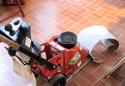
At this point in the process, we became concerned about the pace of the work. Keep in mind we were doing this at night after a full day of work. We were exhausted, and the clock was ticking. You might remember that we weren't exactly packing up our apartment yet? So we decided to call in reinforcements. Enter: The Rip'r'Stripper.
This machine rocks. If any of you are contemplating linoleum floor removal, skip the handwork and rent this from the start instead. Seriously. Watch it in action:
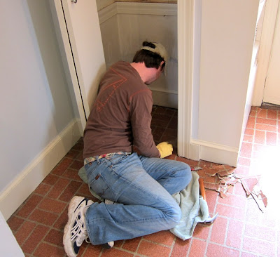
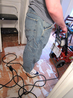
This is probably a good time to talk about T's floor removal attire. It actually got better than the knee pads, believe it or not. We were both wearing old clothes and shoes because the work we were doing was incredibly dirty. T remembered at some point that he owned a pair of jeans he'd purchased years back to wear to a Habitat for Humanity mission. A work of art, these jeans. Baggy, stonewashed, and featuring tool-carrying capability? Oh, the hilarity. I'm not kidding when I tell you that some of those long nights at work in the house, these jeans were about the only thing that could make me crack a smile.
Now with the Rip-r-Stripper, we uncovered a lot of floor very quickly, but would still need to take up the nails on the subfloor and lift it by hand. The pantry and the bathroom were clear at this point, but we hadn't yet peeked under the subfloor in the heart of the kitchen - otherwise known as Gorgeous Kitchen Floor Promiseland. Here's the bare kitchen, free of lineoleum, still covered in plywood and glue remnants:
There are no photos that demonstrate what happened next, so you'll have to take my word for it. As T set out to pull up the plywood in the heart of the kitchen, we made a big, fat discovery:
The original floors were gone in the center of the kitchen.
What a blow. All that work... and then no payoff. T was pissed and immediately came up with about 5,000 other better uses of his time for the week's worth of 5 p.m. - 1 a.m. shifts we'd invested. I tried to make the best of it, saying that we wanted the linoleum gone and at least now it was... even if what would replace it was a mystery. It was no good. No good at all. Luckily we headed out to the Outer Banks the next day to drown our sorrows in oysters.
And so that last floor photo is exactly how the floors still look today. There's pretty paint on the wall and stuff around, at least... but we're still walking on plywood.
We do have a plan. It's in action as of yesterday, actually - maybe that's why I decided our floor saga was finally worth telling. Tomorrow I'll share our original vision for the kitchen floors, when we thought we had pine under there to work with. Then I'll show how we've shifted our vision now that we'll have to create a floor from scratch.
Any other flooring surprise stories out there? It might make us feel better.
Oh, and as for the upstairs hallway: at least we do have full original floors up there. And now that we had all this practice in the kitchen, removing the lineoleum up there should be quick and easy. (Knock on, you know, wood. Which is waiting to be uncovered after decades of suffocation.)
I think the Habitat for Humanity jeans need to make another appearance for that little project, don't you?
Friday, June 10, 2011
Friday I'm in Love
This was the first week we relaxed in our house since we bought it. Lots of couch time, lots of wine, lots of fun... just what the doctor ordered. We'll get back into the swing of home projects a bit this weekend, but these days of just being have been so necessary for our peace of mind. And so in a great week full of happy moments, here are three fun little things that really made me smile:
Mumford and Sons at Merriweather Post Pavilion, last night
Oh, this show. The best I've seen in ages. A band I love, using all of my favorite instruments, playing their hearts out on a stage... just the perfect, perfect night, with some of my favorite folks. Swoon.
Mini Warbler
How many times have I watched this little man this week? You don't want to know. He just kills me.
Million Dollar Decorators
Good lord I love this show. First: Kathryn Ireland, whose textiles I've been obsessed with for years. If I only knew before now that she was the perfect combination of British zane and boobs-out lush, I'd have moved to California to try and work for her years ago. Martyn Lawrence Bullard, so dapper and fabulous and somehow looking like the gayer cross between George Michael and Morrissey, I salute you. Nathan Turner... I dig your style. Jeffrey Alan Marks and your saucy boyfriend/employee, yes please. And Mary McDonald... you terrify me. But in a good way. I'm totally hooked on this crew and their mad skills, as ridiculous as they (and their clients) are. Also: I secretly always wish I could move to California, and this show feeds that little West Coast part of me that I shush when it tries to come out to play.
That's all from me. Up tonight: Ryan Bingham! Yes please. Have a great weekend, everyone!
Tuesday, June 7, 2011
On color
Many of my friends consider me their color guru, and I'm the one they call when they have dilemmas and/or paralysis about interior painting. They'd say this is because I'm good at it, but I'd say that it's really because I'm not scared of paint and I have a process. My friends know that A) I've painted the interior of every place I've lived in since college, landlords be damned, and B) to those who know me best, it's the color that makes my living spaces look like "mine." So I'm on their figurative color speed dial, and I'm cool with that.
Being such a color person, moving into this house was actually a huge challenge for me. My tried and true color palette simply didn't work here. The rooms were too full of light, too open (except for the, um, current living room situation), and too vibrant for the super-saturated colors of my past homes. Obviously, these "problems" make for fantastic features of the house, but they really did force me to entirely rethink my decor color palette. And so I believed in my process, and it didn't fail me. In color process, I trust.
In general, I think many folks are afraid of paint, and I've never quite understood why. I see paint as the quickest fix out there, an immediate and inexpensive way to completely change a room. Even better: if you don't like the results, you can just paint over it again. So easy, right?
Well, no. Over the years friends have told me that paint intimidates them, or that there are too many paint colors to choose from at the store. I've heard stories of buying a gallon of paint in a panic, then coming home and realizing that it's all wrong. I've heard stories of endless trips to the store with the intention of buying paint, but paralysis preventing a purchase every time.
I tell these friends my paint color process. Often they still want an in-person consultation. I've helped friends paint in the past, but this gets harder as time marches on and we scatter. So here, then, is my paint color process, posted for eternity. So that I can send them a single link next time. And so that maybe you can benefit, too, if you're also stricken by paint phobia.
1. Relax and gather inspiration. If you have paint phobia and are therefore reading this, I'm going to assume that you need to take time to make a good color decision. So that means no impulse paint buying at the store, then feeling like you have to coat your entire house in said horrid color in order not to waste $40. We're taking it slow. We're noticing rooms in magazines and catalogs, on tv shows and movies, and in friends' homes that inspire us. We're looking into our closets and noticing the colors that are there, or out in our gardens. We're thinking about color in a relaxed manner. We are breathing.
2. Bring home paint cards. No, I didn't stop at 'paint.' At this level in the process, we are simply going to the paint/hardware store with our inspiration ideas in mind and collecting every color card that looks like it might fit the bill. There's no limit to the amount of cards you can stash in your purse, so go for it. Anything and everything that peaks your interest in that big color card display needs to go home with you.
3. Tape paint cards to the wall. Here's where you'll begin to make an informed choice about a color you're bringing into your home, and you're going to do it slowly, over the course of a couple of days, minimum. Remember how I told you this is a slow process? You're going to do nothing but live with those cards and notice them, at all times of day and in all different light, for days. I can't tell you how many times I've been certain of the right color in the store, then gone home and watched it turn into something terrible on the wall. Every room and every home is different, and most of those differences are due to light. The colors that looks amazing in your aunt's kitchen could look like mud in your kitchen, and that's okay. You'll find the right color if you go through the process. In our current house, we have rooms where the same paint color looks entirely different on three walls. Light was absolutely our biggest challenge with selecting our colors, and we never would've gotten it right if we didn't live with rooms full of paint cards for weeks on end. Here's another reason why living with paint cards is important: you might completely change your mind about what kind of color should be on the wall, but this inspiration won't strike until your mind is responding to what's taped up there. This happened in almost every room of our new house, by the way.
4. Buy paint samples of your favorites and put them on the wall. Nope, we're not buying quarts or gallons yet - hold your horses. Before you commit to a color, it's crucial to buy as small an amount as you can of your favorites and see the real deal color on your wall. Home Depot and Lowe's sell paint samples for less than $3. It's some of the best money you'll ever spend. Again: light is a tricky mistress. So many times, I've loved the color on a card, but as soon as paint touches plaster, it's a reject. Por ejemplo: we tried to paint almost every wall in our house a version of light yellow, which I loved on the paint cards, but every time we put it up on the wall it looked abysmal. Our house simply didn't want to be light yellow, no matter how hard I tried. But I'm so glad I figured that our with samples rather than gallons. Another reason paint samples are so important is that if you've fallen in love with the second shade down on a paint card but it's not quite right when you paint the sample, you might surprise yourself by buying a sample one tone deeper, that based on the card alone seemed too dark. I'll repeat a point from #3 here, too: sometimes you'll surprise yourself and decide on an entirely different color than what you intended. And I'll repeat again: this also happened in almost every room in our house.
5. Buy your paint! So you're pleased with a splotch on the wall and you're ready to commit. Maybe it took you a day to get there, maybe it took you a month. But whatever the timeline, following this sort of process ensures you won't make mistakes. And as long as you're willing to live with cards and paint splotches everywhere for a while, the payoff is huge. I'd suggest buying more paint than you think you'll need, and consider going low- or no-VOC, too. I'll talk more about that soon.
Being such a color person, moving into this house was actually a huge challenge for me. My tried and true color palette simply didn't work here. The rooms were too full of light, too open (except for the, um, current living room situation), and too vibrant for the super-saturated colors of my past homes. Obviously, these "problems" make for fantastic features of the house, but they really did force me to entirely rethink my decor color palette. And so I believed in my process, and it didn't fail me. In color process, I trust.
In general, I think many folks are afraid of paint, and I've never quite understood why. I see paint as the quickest fix out there, an immediate and inexpensive way to completely change a room. Even better: if you don't like the results, you can just paint over it again. So easy, right?
Well, no. Over the years friends have told me that paint intimidates them, or that there are too many paint colors to choose from at the store. I've heard stories of buying a gallon of paint in a panic, then coming home and realizing that it's all wrong. I've heard stories of endless trips to the store with the intention of buying paint, but paralysis preventing a purchase every time.
I tell these friends my paint color process. Often they still want an in-person consultation. I've helped friends paint in the past, but this gets harder as time marches on and we scatter. So here, then, is my paint color process, posted for eternity. So that I can send them a single link next time. And so that maybe you can benefit, too, if you're also stricken by paint phobia.
1. Relax and gather inspiration. If you have paint phobia and are therefore reading this, I'm going to assume that you need to take time to make a good color decision. So that means no impulse paint buying at the store, then feeling like you have to coat your entire house in said horrid color in order not to waste $40. We're taking it slow. We're noticing rooms in magazines and catalogs, on tv shows and movies, and in friends' homes that inspire us. We're looking into our closets and noticing the colors that are there, or out in our gardens. We're thinking about color in a relaxed manner. We are breathing.
2. Bring home paint cards. No, I didn't stop at 'paint.' At this level in the process, we are simply going to the paint/hardware store with our inspiration ideas in mind and collecting every color card that looks like it might fit the bill. There's no limit to the amount of cards you can stash in your purse, so go for it. Anything and everything that peaks your interest in that big color card display needs to go home with you.
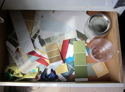
View from my paint card drawer, this morning.
I told you I know how to fill a purse with these things.
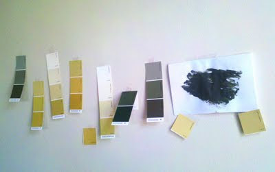
3. Tape paint cards to the wall. Here's where you'll begin to make an informed choice about a color you're bringing into your home, and you're going to do it slowly, over the course of a couple of days, minimum. Remember how I told you this is a slow process? You're going to do nothing but live with those cards and notice them, at all times of day and in all different light, for days. I can't tell you how many times I've been certain of the right color in the store, then gone home and watched it turn into something terrible on the wall. Every room and every home is different, and most of those differences are due to light. The colors that looks amazing in your aunt's kitchen could look like mud in your kitchen, and that's okay. You'll find the right color if you go through the process. In our current house, we have rooms where the same paint color looks entirely different on three walls. Light was absolutely our biggest challenge with selecting our colors, and we never would've gotten it right if we didn't live with rooms full of paint cards for weeks on end. Here's another reason why living with paint cards is important: you might completely change your mind about what kind of color should be on the wall, but this inspiration won't strike until your mind is responding to what's taped up there. This happened in almost every room of our new house, by the way.
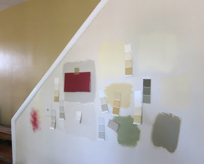
Early hallway and dining room visioning
4. Buy paint samples of your favorites and put them on the wall. Nope, we're not buying quarts or gallons yet - hold your horses. Before you commit to a color, it's crucial to buy as small an amount as you can of your favorites and see the real deal color on your wall. Home Depot and Lowe's sell paint samples for less than $3. It's some of the best money you'll ever spend. Again: light is a tricky mistress. So many times, I've loved the color on a card, but as soon as paint touches plaster, it's a reject. Por ejemplo: we tried to paint almost every wall in our house a version of light yellow, which I loved on the paint cards, but every time we put it up on the wall it looked abysmal. Our house simply didn't want to be light yellow, no matter how hard I tried. But I'm so glad I figured that our with samples rather than gallons. Another reason paint samples are so important is that if you've fallen in love with the second shade down on a paint card but it's not quite right when you paint the sample, you might surprise yourself by buying a sample one tone deeper, that based on the card alone seemed too dark. I'll repeat a point from #3 here, too: sometimes you'll surprise yourself and decide on an entirely different color than what you intended. And I'll repeat again: this also happened in almost every room in our house.
Kitchen wall, covered in paint cards and splotches... first I had yellows up, then grays, then greens, then reds, then blues. And finally, I stumbled upon the perfect blue-green (BM Azores) that looked fantastic with all my bright kitchen accents. It took a month to get there.
Dining room accent wall. Was it going to be Chestertown Buff, like the wall behind it? A beige or lighter yellow? Olive Branch, like the rest of the dining room? Eucalyptus Leaf, like the mantel wall? Nope. It turned out that the wall wanted to be red: Behr's Dozen Roses, to be specific. After weeks of staring at splotches, we finally got there.
5. Buy your paint! So you're pleased with a splotch on the wall and you're ready to commit. Maybe it took you a day to get there, maybe it took you a month. But whatever the timeline, following this sort of process ensures you won't make mistakes. And as long as you're willing to live with cards and paint splotches everywhere for a while, the payoff is huge. I'd suggest buying more paint than you think you'll need, and consider going low- or no-VOC, too. I'll talk more about that soon.
Happy painting!
Monday, June 6, 2011
D-Day hangover
I'm nursing a few hangovers this morning. There's the "oh how I love my sisters-in-law and my New Mexico besties" hangover, after a weekend where we were lucky enough to host them. There's the "is it possible to have so much fun in one weekend and connect with so many fun new friends?" hangover. There's the "oh wow, I ate and drank sort of an obscene amount this weekend" kind of hangover. And last but not least, there's the D-Day hangover.
Our D-Day was Friday afternoon, when our first official weekend guests arrived. Since we moved in, Friday was the date we knew we'd be revealing our place to family, in an unfinished-but-most-definitely-getting-there sort of way. We'd been working so hard getting ready for the big reveal by the time Friday rolled around... even if our big reveal still missed key features such as a kitchen floor or dining room furniture. The painting, the hanging, the organizing... just exhausting work making it happen, and I know we couldn't have pushed any harder than we did the last few weeks. I'm proud of us, and the payoff was huge... so very worth it as soon as T's family walked through the door. Here's a little of what they saw:
Our D-Day was Friday afternoon, when our first official weekend guests arrived. Since we moved in, Friday was the date we knew we'd be revealing our place to family, in an unfinished-but-most-definitely-getting-there sort of way. We'd been working so hard getting ready for the big reveal by the time Friday rolled around... even if our big reveal still missed key features such as a kitchen floor or dining room furniture. The painting, the hanging, the organizing... just exhausting work making it happen, and I know we couldn't have pushed any harder than we did the last few weeks. I'm proud of us, and the payoff was huge... so very worth it as soon as T's family walked through the door. Here's a little of what they saw:
Victorian Fug mantel no more! Here's the super-simple mantel that our carpenter made for us, which features simple shelving to help store electronics and space on the wall for our oh-my-word-why-didn't-I-realize-it-was-so-big television. Do I love the idea of having the television over the mantel? No. But is there anywhere else in the room it can possibly go? No. So I've moved on. And why are the angled shelves so asymmetrical, you ask? It's because they're doing their best to deal with the insanely angled wall behind them. Here's hoping that as the rooms and walls get completely furnished, I'll stop noticing. We're planning on painting the insides of the shelves at some point, which I think will help in that regard.
Living room, still "cozy." We've decided we probably can't get the wall that closes off the living room taken down until the end of the summer, so until then we'll just deal with the space issues it creates. (And try not to invite more than two people over who needs seats.)
Speaking of needing seats... welcome to the dining room! I sold our bar-style table with high stools on Craigslist, but our new table won't be delivered until the end of the month, at which point we'll start shopping for chairs. T wants to set up a temporary Moroccan lounge in here, complete with a hookah. Hmmm.
Paint, almost everywhere. Also almost everywhere: sticky notes listing which items will be hung where. The sticky note on red: "Family Gallery Wall." That Ikea bag: full of said family photos. We'll get there.
Oh, Azores, I do adore you on our kitchen walls. As long as it took me to settle on a color, I'm thrilled with this one. And also thrilled that the new pantry door we ordered is currently leaning on an opposite wall, ready for us to install in place of that old bifold door. See the coolers on the floor over there? Full of condiments and cooking ingredients that will be hung inside the door once we get it up. That's going to be a very happy day.
My home office, aka the "guest overflow on an air mattress" room. I have a few small items to frame and hang, but otherwise this baby's done.
The bathroom. You've seen it before, but dang if it doesn't make me happy enough to show again.
The guest room. Goodbye garish yellow, hello BM Classic Gray. I wanted a calm and neutral room for our company, and this color fits the bill perfectly.
That's all for now, unless you want to see evidence of a failed ceiling fan installation in our bedroom. Related: we've got to find a handyman/electrician/magicman, stat.
Thanks for reading after my neglectful behavior over the last two weeks. For what it's worth, getting over the D-Day hump defintely means that blogging is back on the agenda. (As soon as I take more Advil for this pounding head of mine.)
Subscribe to:
Posts (Atom)

